
Why We Made “The Brain — is wider than the Sky” Twice
Most quote brands look at a famous line, pick a design treatment, and call it done.
We made two.
The Brain — is wider than the Sky — is on six pieces in our Emily Dickinson collection. Four of them — tee, mug, journal, phone case — share one design language. Two of them — tee and phone case — share a completely different one. Same line. Same poet. Two ways in.
That wasn’t indecision. The line itself carries both registers, and we wanted both on the rack.
What Dickinson actually wrote
Before the design talk, the poem.
The Brain — is wider than the Sky —
For — put them side by side —
The one the other will contain
With ease — and You — beside —The Brain is deeper than the sea —
For — hold them — Blue to Blue —
The one the other will absorb —
As Sponges — Buckets — do —The Brain is just the weight of God —
For — Heft them — Pound for Pound —
And they will differ — if they do —
As Syllable from Sound —
Three stanzas. Three comparisons. Sky, sea, God. Each one bigger than the last. By the third stanza, the brain isn’t being measured against creation — it’s being weighed against the Creator.
That isn’t a self-esteem poster. That’s heresy with manners.
The opening line is the doorway into all of that. The Brain — is wider than the Sky —. The dashes don’t decorate. They do work. The first dash holds the noun in place before the comparison drops. The second leans forward into the next line of the poem, into for — put them side by side. Read the line without the dashes and it’s a slogan. Read it with them, and it becomes a proposition you’re being asked to verify in real time.
(For the deeper read on Dickinson’s dash habit, see our post on her em-dash signature. This post is about how one of those dashes lives on a garment.)
Two ways the line wants to be set
Here’s what we noticed when we sat with the line long enough.
Read it one way, and it’s structural. Architectural. BRAIN. SKY. PUT THEM SIDE BY SIDE. The poem is making a load-bearing claim about the size of consciousness, and the typography wants to match — bold, declarative, masthead-confident.
Read it another way, and it’s intimate. Whispered. The kind of thing she might have written in the margin of a letter to Sue Gilbert or pressed inside a fascicle she’d just stitched at home. The typography wants to match that, too — italic, ornamented, page-like.
Both readings are real. The poem holds both. We made two designs because one tee couldn’t.
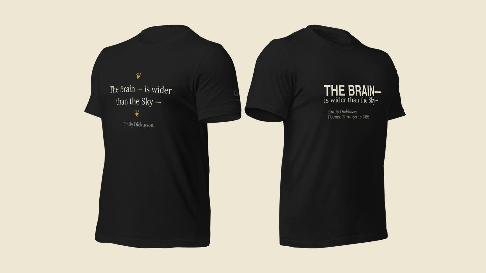
The Wider Sky — the structural reading
The Wider Sky Tee, Mug, Journal, and Phone Case treat the line as a typographic statement.
THE BRAIN— drops in bold structural caps, hard left, with the dash heavy and visible. is wider than the Sky— runs out from the same baseline in italic, the second dash leaning forward into the rest of the unprinted poem.
This isn’t whispered. It’s printed. The composition reads like the title page of a book — a masthead, an inscription, an opening claim. The wearer carries the architectural version of the line: the metaphysical proposition, set in the typography of conviction.
The attribution underneath is more specific than most quote tees ever bother with: Emily Dickinson · Poems: Third Series · 1896. That’s the volume the poem first appeared in, ten years after her death, edited by Mabel Loomis Todd. We cite it because we have it, and because the bibliographic specificity is part of the brand. You’re not buying a quote on a tee. You’re buying a quote with its receipts.
If you want the version of the line that walks into the room and makes a claim, this is it.
The Fleur de Brainiac — the intimate reading
The Fleur de Brainiac Tee and Phone Case treat the same line as a page from a book.
The Brain — is wider than the Sky — sits centered, in flowing italic, stacked across two soft lines. A single small gold hedera fleuron — a printer’s leaf ornament that pre-dates Dickinson’s century by 400 years — frames the quote above and below. Emily Dickinson in small italic underneath.
This is the frontispiece treatment. The same line, but quieter. The fleurons aren’t decoration — they’re framing devices, the kind a 16th-century printer would use to mark a poem on a page. Dickinson herself stitched her poems into hand-sewn booklets at home, called fascicles. None of them were ever published in her lifetime. The Fleur de Brainiac honors that — the line as it lived in private, in books she made by hand, before the world knew what to do with her.
If you want the version of the line that arrives quietly and stays with you, this is it.
Why both, on the same shelf
The argument inside the poem is that the brain — the small, private, interior thing inside the skull — is wider than the sky outside it. That a single mind can hold the universe. That consciousness is the largest container we have.
A line that big can be set as a banner or as a confession. Most poems aren’t this flexible. This one is. The Wider Sky reads it forward — a public claim, set in public typography. The Fleur de Brainiac reads it inward — a private observation, set in private typography. Neither reading is wrong. Neither one exhausts the line.
We left both on the site because some of you want one and some of you want the other, and a poem this strange deserves both. If you’ve ever stood in front of a great painting and noticed that you respond to it differently depending on the day — that’s the same instinct. The poem doesn’t change. You do.
The rest of the Dickinson capsule
The Brain pieces aren’t alone. The full Emily Dickinson collection includes The Possibility Tee and Mug — I dwell in — with the dash relocated to perform the caesura on the body — and The Every Door Tee, built around her quieter line Not knowing when the Dawn will come — I open every Door.
Three Dickinson quotes. Six product lines. All sourced to Thomas H. Johnson’s standard edition of her complete poems. Every dash where she put it. Every attribution checked against the manuscript record.
A poet this good earns the care.
Shop the Emily Dickinson collection · Read more on Dickinson’s em-dash signature

