A Poem About Circles That Grow Wide, and the Cup That Kept Turning Them Into a Bullseye
The hardest part of putting a quote on something isn't always finding the quote. It's just as often the object it goes on and the quote design. A line that's perfect on a page can be illegible on a shirt or absurd on a coffee cup, and no amount of loving the words changes what the physical thing will do to them. This is the story of one quote that fought the object it was printed on for eighteen versions before it stopped — and what that fight taught us about the difference between a quote and a product.
Why Can't You Just Print Any Quote on a Shirt?
Because a printer laying ink onto fabric or journals or tumblers can only hold detail down to a point, and below that the letters turn to mud. There's a floor to how small type can go and still read. That floor is a physical fact, not a design preference, and it quietly governs everything.
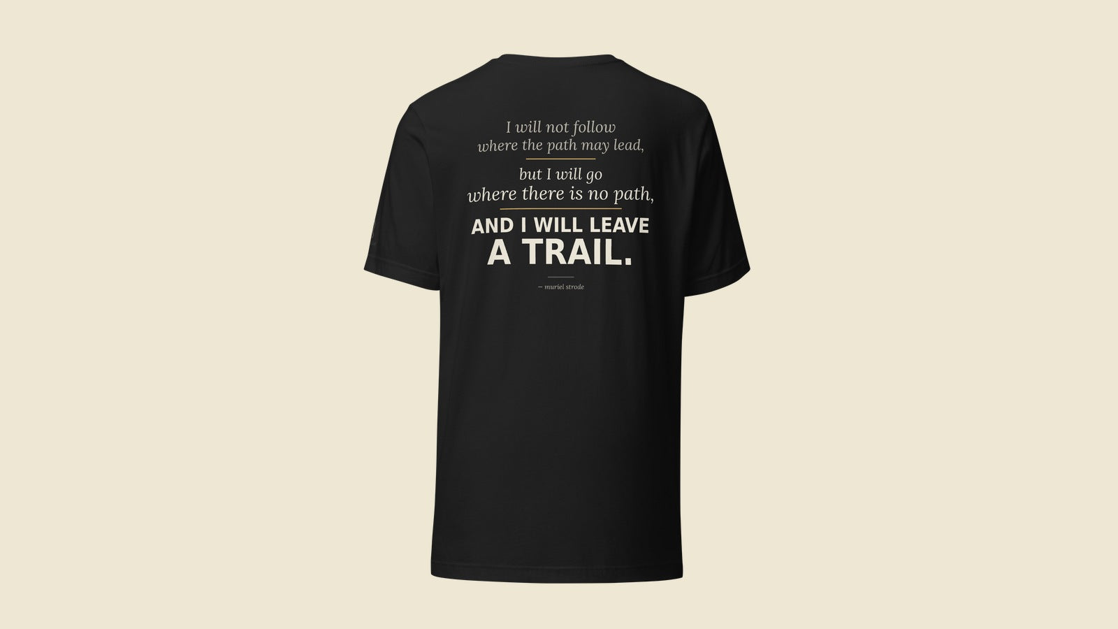
Here's what it means in practice: a long quote needs either more lines or smaller type. Smaller type eventually hits the floor and stops being legible. More lines push the whole composition down the chest until the words are sitting where nobody wants a design to sit. So a genuinely long, beautiful passage often can't go on a tee as-is. You cut it to its load-bearing line, or you move it to an object with more room, or you print on the back of a shirt, or you don't make it. The quote doesn't get to ignore the shirt. That's the first thing the object teaches you, and it's humbling.
What a Curved Surface Does to a Design
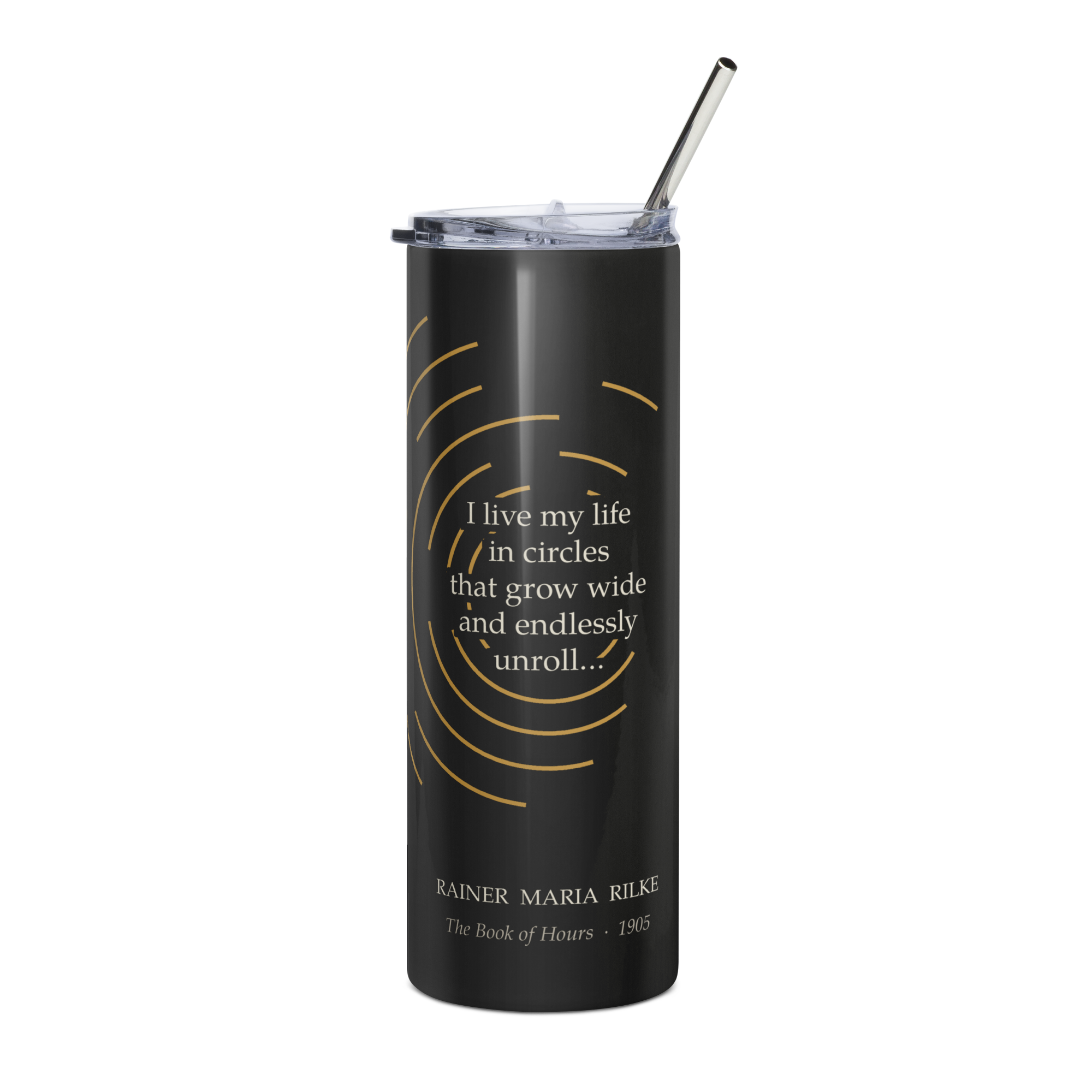
The quote was Rilke: "I live my life in circles that grow wide and endlessly unroll…" It's from The Book of Hours, 1905, translator Jessie Lemont, 1918 and it is almost unfairly perfect for a round object. Circles, on a cup you hold in your hand. We thought it would be the easy one.
It was the hardest thing we've made, at least up to this point.
Every time we drew the circles as actual circles, the cup became a target. Center the rings on the front and you're drinking from a bullseye. Center them on the back and the bullseye just moves out of sight until someone turns the cup. Run the rings off both edges so they'd meet around the back, and at the seam they collapsed into a shape like a staring eye. The problem wasn't the art. The problem was geometry: you only ever see about a third of a cup at once, so any design built around a single center point looks like a target from wherever you're standing.
We redrew it eighteen times. The version that finally worked did the one thing we'd been refusing to do — it stopped closing the circles. Instead of full rings we used arcs, broken deliberately, with gaps set at uneven intervals, borrowing a principle from Japanese design called fukinsei that treats asymmetry and incompleteness as the point rather than the flaw. Nothing on the cup ever resolves into a closed circle. There's no center, so there's no target, so there's nothing to stare back at you.
And then we noticed what we'd actually done. The poem is about a life lived in circles that grow wide and endlessly unroll — circles that, by definition, never close. We'd spent seventeen tries forcing the words into a shape the words themselves reject. The design only worked once it agreed with the line it was carrying.
Why Not Just Ship the Version That's Close Enough?
We could have. The bullseye tumbler was fine. Plenty of stores would have shipped version three and moved on. We didn't, for the same reason we won't sell a quote we can't source: once the words are on the object, the object is part of the quote. A poem about openness printed as a target isn't a small compromise — it's the design saying the opposite of the words. If the thing fights the line, we keep working until it stops, or we don't release it.
We've been here before with attribution. We pulled a Marie Curie quote we couldn't verify — and wrote about it, because the standard applies even when it's inconvenient. The same logic runs through design. Close enough isn't the bar.
What This Means for What You Buy
Most quote merchandise clears exactly zero bars. Nobody checked whether the words are real, and nobody asked whether the design actually serves them — it's a font dropped on a blank and shipped. What we sell has to clear three: the quote has to be genuinely, traceably real; it has to speak to Vickie, who sources every one; and the object has to earn the words rather than fight them. The third bar is invisible when it's done right. You just pick up the cup and it feels obvious, inevitable, like it couldn't have been any other way.
It took eighteen tries to make one look inevitable. That's the part you're not supposed to see. We thought, this once, we'd show you.
The Life in Circles tumbler is in the shop. More on Rilke and The Book of Hours in the Journal.
About the Author
Vickie MacFadden is the founder of Quoteiac. She sources every quote on the site, holds each one to a verification standard, and will pull a line she loves if she can't prove it. And yes, she worked with the designer through all 18 iterations to get to this one she says is perfect.