
Why the Vignelli Canon Still Rules Modern Design
In 2010, Massimo Vignelli published a 100-page PDF called The Vignelli Canon and made it free. No publisher. No paywall. Just a direct transmission of everything he believed about design, given away to anyone willing to read it.
Most people didn’t.
Vignelli spent his career designing things that were meant to last. The 1972 New York City subway map — still controversial, still imitated. The American Airlines identity — used for 45 years before a committee finally replaced it. Knoll furniture catalogues. Bloomingdale’s shopping bags. The Heller typeface. All of it moving in the same direction: clarity over decoration, structure over novelty, meaning over noise.
The Canon is a short book, but it’s dense. Vignelli divides design into two categories: semantic (what something means) and syntactic (how it’s put together). His argument — the one most designers quietly know but rarely say out loud — is that bad design is almost always a failure of one or the other. Either the designer didn’t understand what the work was supposed to communicate, or they didn’t know how to structure it so that communication would actually land.
This is not an abstract principle. It has a very specific enemy: decoration for its own sake.
“The life of a designer is a life of fight,” Vignelli wrote, “fight against the ugliness.” He didn’t mean poor craftsmanship. He meant the accumulation of elements that aren’t earning their place — the extra typeface, the gradient that adds nothing, the layout that fragments attention rather than directing it. The visual equivalent of clearing your throat before every sentence.
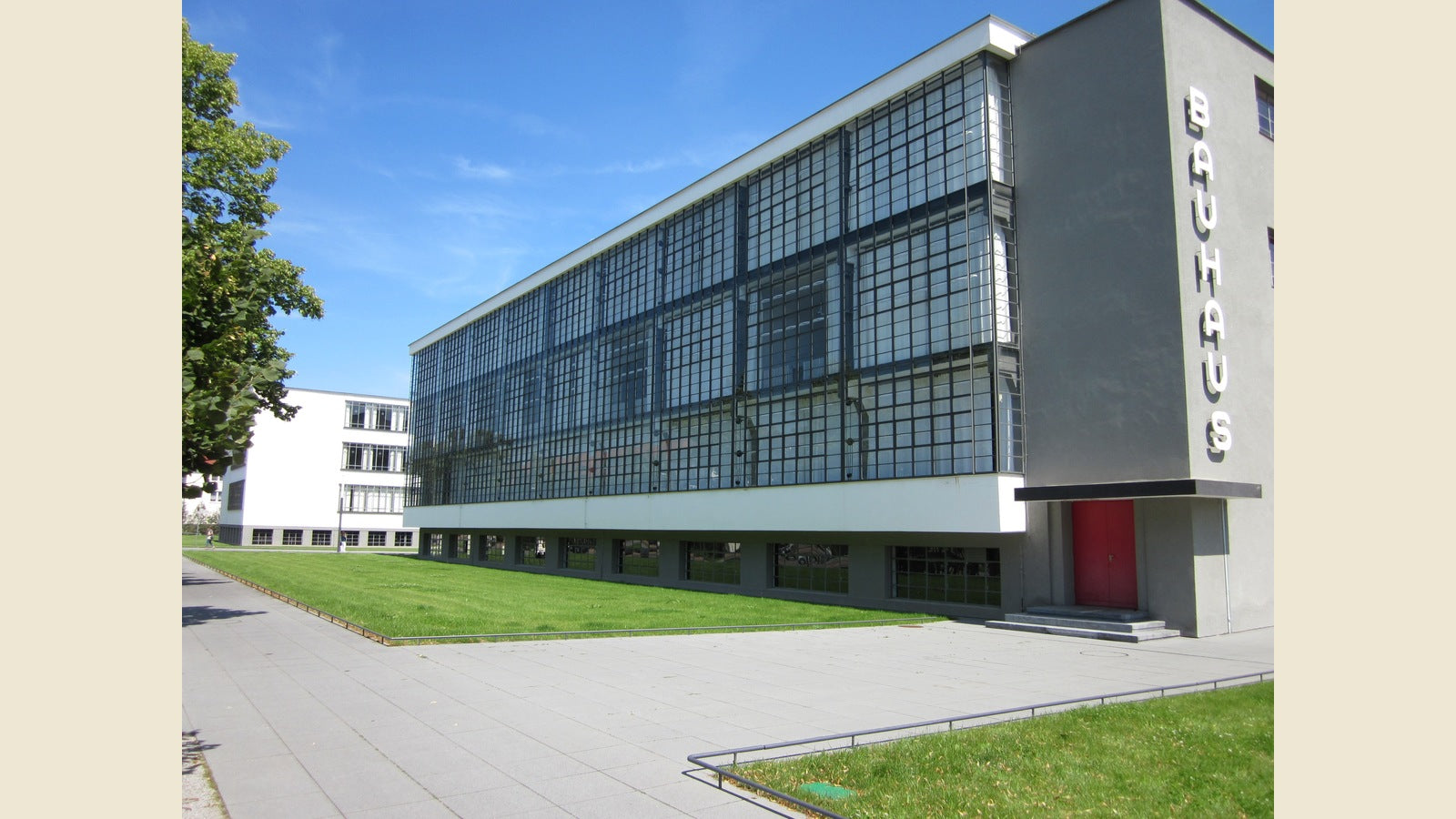
The Swiss Grid that Vignelli practiced — inherited from Josef Müller-Brockmann and Armin Hofmann, codified in Zürich and Basel in the 1950s — is not a style. It’s an argument. The argument is that the eye deserves to be guided, not ambushed. That a reader’s attention is a finite resource and a designer’s job is to spend it wisely. The grid is a discipline that forces every decision to justify itself: Why is this here? Why this size? Why this weight?
Most contemporary design fails that test immediately.
What makes the Canon feel contemporary in 2026 — arguably more contemporary than when it was published — is that the problem Vignelli was fighting has only intensified. Infinite fonts, infinite colors, infinite templates. The tools got cheaper and the discipline got rarer. Everyone has access to the same software that Vignelli’s studio used. Almost no one asks the same questions he asked.
There’s a line in the Canon that doesn’t get quoted enough: “The life of a designer is a life of fight. Fight against the ugliness. Just like a doctor fights against disease. For us, the visual disease is what we have around, and what we try to do is to cure it somehow with design.”
That framing — design as a kind of medicine, applied to a sick visual environment — is the part that ages well. It positions the designer not as a stylist but as someone with an obligation. And it positions the work not as taste but as ethics.
That’s why Vignelli’s Canon still rules. Not because his specific solutions were correct forever — the subway map debate will never end — but because the questions underneath them were correct. What is this for? Who is it for? What does it need to say? What does it need not to say?
Those questions don’t expire. Every generation of designers has to learn them again from somewhere. The Canon remains one of the cleanest places to start.
The Heretics collection at Quoteiac carries the thinkers who asked exactly this kind of question in their own fields — the ones who understood that form is never neutral, and that clarity is always a choice. Browse it here.

