
The Intersection of Abstract Expressionism and Apparel
Abstract Expressionism has a bad reputation for pretension, and most of it is deserved. The canonical criticism — that anyone could do it, that it was arbitrary, that it was the art world congratulating itself — is not entirely wrong. Some of it was exactly that.
But the core impulse behind the movement, before the galleries got involved, was something more serious: the idea that a mark made by a human hand carries information that no other medium can. That gesture is a form of meaning. That the way something is made is inseparable from what it says.
This is why Abstract Expressionism translates to apparel better than almost any other 20th-century art movement.
Consider the problem of putting language on a garment. The worst version — the version that fills fast-fashion racks — is purely literal. A word in a font, stretched across a chest, saying exactly what it says and nothing else. No structure. No tension. No reason for the eye to linger.
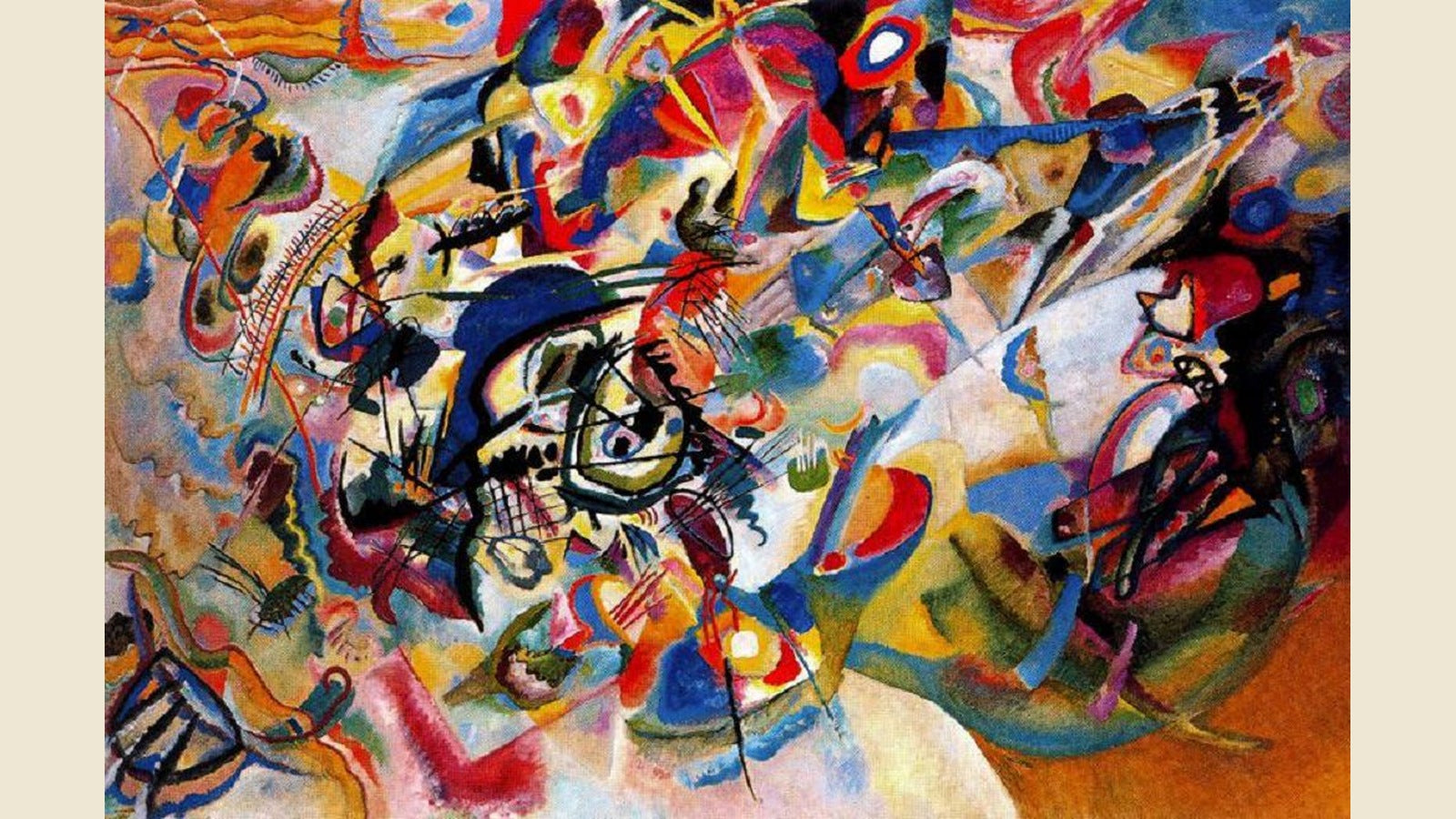
The Abstract Expressionists solved a related problem. Franz Kline’s black-and-white paintings from the 1950s — the ones that look like calligraphy from a civilization that doesn’t exist — work because the mark carries weight before the eye interprets it as a letter or a symbol. The gesture arrives first. The meaning follows. The sequence matters.
Mark Rothko, working in the opposite direction — soft rectangles of color, no gesture, maximum stillness — was solving the same problem from the other end. He wanted the work to do something to the viewer before they decided what it meant. To create a physical response — he called it the trembling — that preceded interpretation.
What both Kline and Rothko understood is that visual experience has a timeline. The eye moves through an image in a specific order, and that order can be designed. The composition can decide what you see first, what you hold, what you read last.
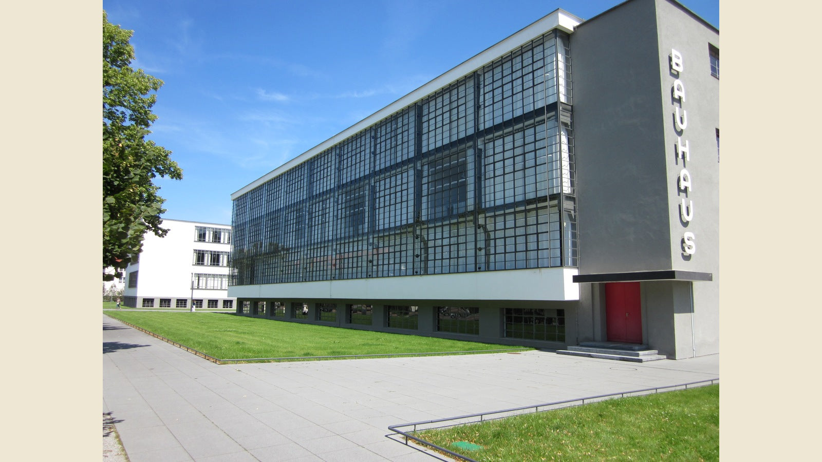
Typography — serious typography, the kind Massimo Vignelli and Herbert Bayer were practicing in the same era — operates on the same principle. The weight of a typeface, the spacing between letters, the placement on a page or a garment: all of it creates a sequence of attention before a single word is read. The meaning of the word and the meaning of the mark are two separate things arriving in the same space. The design question is whether they reinforce each other or fight each other.
This is the gap that most quote apparel lives in: the word and the design are fighting each other, and the word wins by default because it’s legible. The visual experience collapses into pure reading. The garment becomes a billboard.
The antidote isn’t more decoration. It’s the Abstract Expressionist instinct: start with the mark, trust the gesture, let meaning build from structure rather than on top of it. A quote printed at the right weight, in the right proportion, with the right breathing room, does something before it says something. That’s the difference between a garment you wear and a shirt you explain.
The Stoic Wisdom collection and the Inner Life collection at Quoteiac are built on this principle — language treated as a visual material, not just as information. Take a look.