
Hiroshige, Negative Space, and the Swiss Grid
Utagawa Hiroshige’s 19th-century woodblock prints, specifically 'The Fifty-three Stations of the Tōkaidō,' utilize a horizontal four-zone grid and strategic negative space that predate the formal principles of 20th-century Swiss Grid typography.
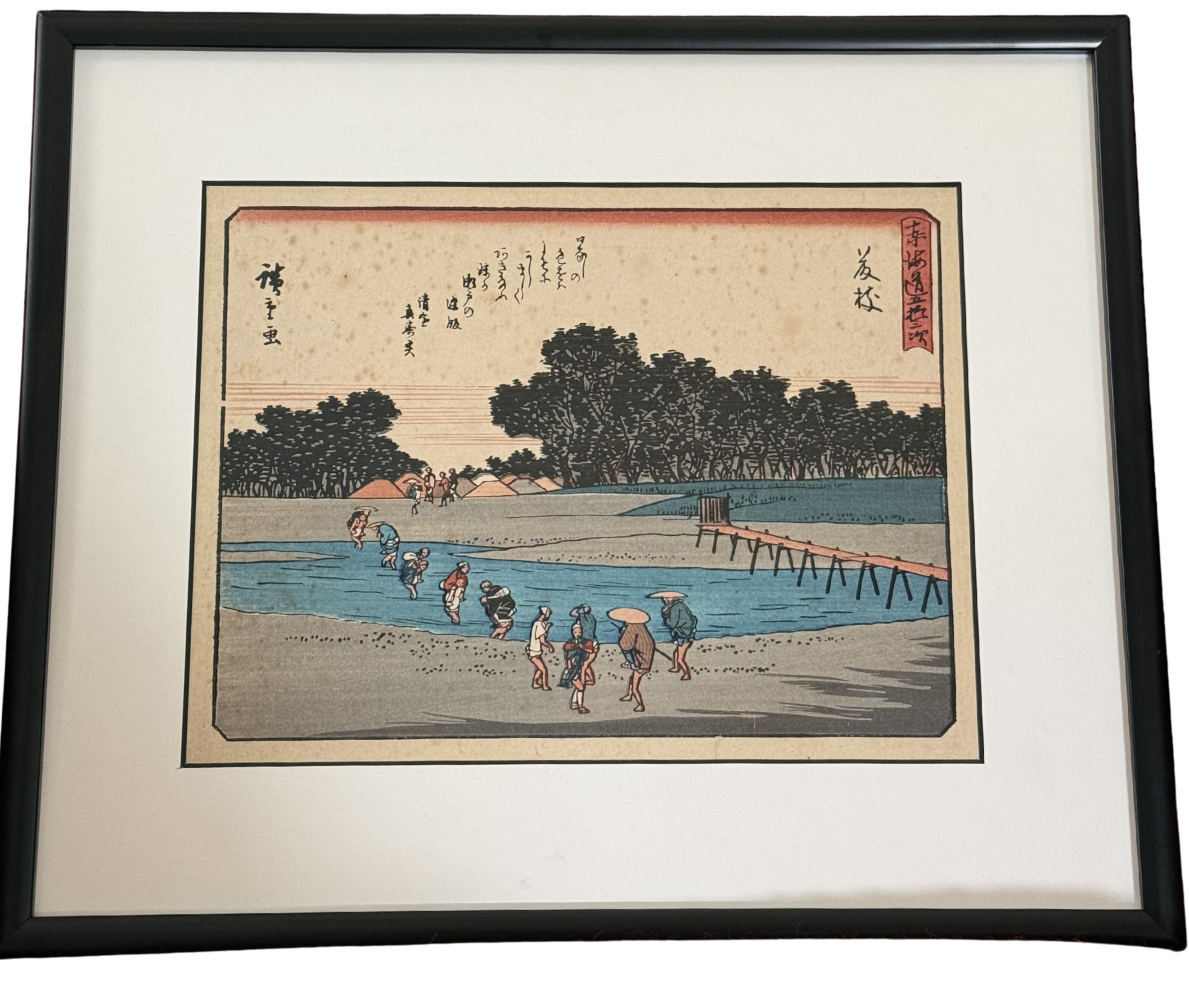
The print above is Station 24 of The Fifty-three Stations of the Tōkaidō, published around 1833 in what became known as the Hoeido edition — the most celebrated printing of the series. Travelers are wading across the river. Porters carry passengers on their backs. A wooden bridge structure enters from the right edge and disappears. A dense mass of dark trees holds the horizon line. And above all of it: sky. Vast, pale, almost entirely empty sky, occupying roughly forty percent of the image.
That sky is not background. It is structure.
This is the thing that takes time to see in Hiroshige’s work — and in Hokusai’s, and in the broader Ukiyo-e tradition they both worked within. The empty space isn’t a default. It’s a decision. The cream expanse above the tree line is doing the same work that white space does in a Josef Müller-Brockmann poster, or a Massimo Vignelli page layout, or any serious piece of Swiss Grid typography: it gives the weighted elements their gravity. The dark tree band feels heavy and absolute because of what surrounds it. The figures in the water feel small and determined because the sky above them is so still.
Remove the sky and the composition collapses. The trees become a hedge. The figures become a crowd. The print stops being a meditation on the difficulty of crossing and becomes a scene report.
The woodblock technique enforced a discipline that Swiss designers would later choose deliberately. Each color in a woodblock print is a separate carved block — a physical object that must be inked and pressed in precise registration with every other block. You cannot easily graduate a color. You cannot blend. You get flat zones: the Prussian blue of the river, the near-black of the tree mass, the burnt orange of the bridge, the warm gray of the sandy bank. Every color is a commitment. Every element earns its place or it doesn’t exist.
This is formally identical to what Armin Hofmann was teaching at the Basel School of Design in the 1950s — the idea that a composition should contain only what it needs, that each element should be under pressure to justify its presence, that flat color is not a limitation but a clarifying force. The constraint is the discipline. The discipline is the style.
Hiroshige’s horizontal grid structure would also be immediately legible to anyone trained in Swiss typography. The composition runs in four clean bands: sky above, the tree silhouette as a hard dividing rule, the river as a color block, the foreground bank as the content zone. Stack them. Read them top to bottom. The hierarchy is unmistakable. There’s no visual noise asking you to reconsider the order. The eye knows exactly where to go.
What makes this more than a formal coincidence is the shared problem both traditions were solving: how do you communicate something specific to a large audience, cheaply, reproducibly, and with enough visual authority that it doesn’t get ignored?
The Fifty-three Stations was mass communication by the standards of Edo-period Japan. Hiroshige produced hundreds of prints in the series, distributed widely through commercial publishers. The Tōkaidō road was the main artery connecting the political capital to the imperial city — everyone knew the route, everyone knew the stations. The prints were the equivalent of a photo essay distributed at scale. To work at that scale, across that many prints, with woodblock as the medium, you needed a visual language that was specific enough to be interesting and disciplined enough to be reproducible. Flat color, strong horizontal structure, controlled negative space, restricted palette. The grid wasn’t a theory. It was a production requirement.
The Swiss designers of the 1950s were solving the same problem in a different context: postwar Europe, offset printing, international corporate clients who needed design that would hold across languages and formats. Helvetica, grid systems, flat color, generous white space. Not a style chosen for elegance — a system built for reproducibility at scale.
What Hiroshige understood, and what the Swiss Grid formalized, is that restraint is a form of respect for the viewer. The empty sky is not laziness. It is the designer’s decision to stop — to say: this much, and no more.
The meaning lives in the space between the elements, not in the accumulation of them. Our Thoreau Enso tee is built on this exact logic — a single brushstroke circle in the upper sky, the line of text breathing beneath it, the rest left open. Hiroshige would recognize the geometry.
That’s the principle behind the typography at Quoteiac. A quote printed at the right weight, with the right breathing room, in the right proportion — doing something before it says something, the same way the Ōi River crossing does something before you read the poem floating in the sky above it.
The Heretics collection and the Stoic Wisdom collection are built on this discipline. Browse them here.
